Wednesday, May 12, 2010

the right stool!

Great stools & how fantastic: I have not seen them five hundred times over already!
Troika bar stools by G.O.D (www.exhibit.net.au)

Sometimes it's about finding the right piece. That's a difficult thing to do given the incredible amount of choice we have. More often than not the wrong selections are made in interiors and money is rarely the reason. Most people don't really know 1) what is available out there and 2) what that perfect piece looks like (trust me there is always a perfect piece). The secret is taking your time and considering options that you normally would not. Stepping out of your comfort zone will give you new options you never truly considered and will bring you closer to making that right choice. Don't worry, if you still don't know; call me! Chances are I do.

Tuesday, May 11, 2010


Matthew Cerletty, Kohler, 2007, oil on linen, 39"x27"


Matthew Cerletty, Diet coke, , 2007, graphite on paper, 44"x27"


Matthew Cerletty, Diet coke, 2006, graphite on paper, 28"x17"

Hurray Mathew Cerletty (www.rivingtonarts.com)! He removes everything but the brand name-like Warhol's Brillo boxes, a consumer item becomes art.

Monday, May 10, 2010

perfection!


Ralph Pucci international introduces the round Vine table; new to the Bristow-Proffitt collection. Not much to say, it speaks volumes for itself! Measuring 30.5"h x 54" dia.it comes with marble top and asymmetrical brass, bronze, stainless-steel or painted steel base which comes in red and custom made colors. (www.ralphpucci.net)


Thursday, May 6, 2010

"PEACOCK CHAIR" BY DROR FOR CAPELLINI (www.cappellini.it)

INK ON PAPER

ROUGE LIVING "PEACOCK CUSHION"


"PEACOCK DARK' HAND KNOTTED TIBETAN WOOL AND SILK BY MATTHEW WILLIAMSON ( www.therugcompany.info)
GIANBATTISTA VALLI AUTUMN /WINTER READY TO WEAR
OSBORNE & LITTLE "BANSWARA" WALL PAPER IN COLOUR
LIZZO "E09112"COTTON VISCOSE, FROM THE MATA HARI COLLECTION

The crazy fabulous peacock is back; thank goodness! I can really use some fabulous right about now. Although most associate the peacock with folly and drama anything goes as far as interiors are concerned. Any space can benefit from peacock inspired acessories textiles and furnishings. If yours is a classical space and restraint is your thing, an antique peacock paper screen will add just the right touch of bold. On the other hand if you are wild and live in an eclectic environment, feel free to upholster your walls with some peacock inspired textile and throw in a rug while you are at it. whatever the case may be, the proud peacock inspires some serious decorating.


Wednesday, May 5, 2010


100% DESIGN LONDON (www.100percentdesign.co.uk), was smaller but more spirited than ever with increased numbers of emerging designers. Nothing like a global economic breakdown to get designers going again. I say, the lovely Ana Maria (accidental, I think not) has created the noose light: a macabre translation of the bare light globe.


Tuesday, May 4, 2010


Suzani textiles, the tasteful have been on board
for a while! Join them;add some texture, colour and
pattern to your life. Your space will thank you
for it. What's the worst that can happen: you hate the
look. Just save it for your next yard sale. Where can
you get them? If you are going to be in Central Asia,
it's the kind of item you aim for; if you are not, no worries
check out (www.yurdan.com).

Monday, May 3, 2010


The traditional Ikat Weave, an ancient and highly technical craft of woven threads on narrow looms. Ikat, such a beautiful and natural introduction into one's home; it's such a great way to introduce a worldly feel!

Thursday, April 29, 2010

well designed

More restaurant
Tides-Restaurant
More Lobby
Tides-Lobby
Tides-Lobby

The tides-exterior
The Raleigh-poolside

Here I am , back from my well deserved, wonderful Floridian holiday. Before you get crazy and think I went to Tampa, you should know I flew straight to South Beach and lounged at the Raleigh (http://www.raleighhotel.com),/
favorite poolside hangout ever for two weeks straight with a Mojito in one hand and a copy of Vanity fair in the other. Being completely free with nothing but time on my hands (awesome) allowed me to visit various spots I had been dying to visit.
First on my list was the Tides(http://www.tidessouthbeach.com/), it's been around since 2007 and although many attempts at a visit were made on my part they never really worked out. I remember blogging about it at some point, feeling that I had a pretty good grasp on the vibe and essence of the hotel, but I was not prepared for the experience at all.

Kelly Wearstler is a genius; she is a designer's designer. I see a lot of great things, but very few re-energize and inspire me. This hotel is exquisitely put together; this designer focuses on the details, the bigger picture is just a result of well contemplated fine points. The combination of materials and finishes as well as their application are flawless. The spaces are layered, rich and enveloping. It's hard to leave, much less enjoy your new destination. This hotel is tough to beat! I was all around impressed, but the washrooms (lobby) really did me in. Not only are the material selections mind blowing (exotic stones and wood veneers) but they are so perfectly combined. I love it when designers focus on detail; there is such beauty in natural materials and they can truly be taken to the next level when a designer integrates the very forgotten element of tradesman ship.

Thursday, April 15, 2010

Igloo..."on the cover of a magazine!"


April is an exciting month here at Igloo! This month, we celebrate 5 years in the business and what better way than to grace the cover of a magazine? This month's Maison & Demeure.

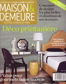
This is a bedroom that both Anna and I are very proud of because it's a perfect example of how to properly use scale, pattern and colour. The pallet started off with a South Asian feel, but after much consideration, we took a drastic left turn and brought the room to all new heights. Here's how we did it...
A sisal area rug covers the Cumaru (Brazilian Teak) floors, and to top it all off...a zebra (no zebras were harmed in the making of this room!).

The black & white is a big part of detailing for me. "Every successful room should have a black and white pattern; Fornasetti is the perfect helper when it comes to the that."

Ocean-blue grass cloth wall covering behind the headboard, brings texture and delivers a dramatic, yet soothing colour.
A screen-like patterned wall covering on the ceiling...really? YES...or should I say 'ceiling covering'?

How could you not notice the yellow bed?...YES-it's big, yellow, and beautiful! But, don't worry, the bed matches the two yellow chesterfield sofas in the Living room...I know what you're thinking; and you're right-we are crazy! No one here is denying that! However-the end result speaks for itself :)

The mirror console and black high gloss Ghost chair is the perfect duo to glam up this bedroom...Igloo style! A black framed octagon shaped mirror gently rests up against the wall-no need to fix it to the wall. Don't forget the yellow drum-a perfect bed site table. A black metal, heart-shaped box of our favourite Fauchon chocolate hang out on the mirror console to sweeten up the deal.

Strong, confident and unapologetic. This room proudly stand up to say, "Here I am - love me or hate me!" We love it!!

Anna and I always say to each other "...every environment we create is a reflection of our clients...and of our passion".

Wednesday, March 10, 2010

Ahoy Matey!


I wouldn't usually say this, but I was wrong. I came across this boat light fixture about a year ago in a catalogue and thought...where the hell would this go? I answered myself by saying "in the garbage!" this is when I look back and apologize to the chandelier! Here is a clear case and point-everything has it's place-content is everything. This space actually looks good. If you removed this sail boat, the space would become very regular and not worth mentioning. Ahoy Matey!

Tuesday, February 23, 2010


Go Vivienne Westwood! This fashion icon (remember the gorgeous wedding dress Carry wore right before Big stood her up)? This "femme a tout faire" collaborates with Cole & Sons (http://www.cole-and-son.com/) drawing inspiration from her signature prints and patterns , translating them into gorgeous wallpaper designs.
"It is good when my ideas get carried over into other artistic media. This collection is a perfect opportunity to be able to work with a heritage company like Cole & Son and to see my ideas from fashion translated into the world of interiors and wallpaper," comments Westwood.


Wednesday, February 17, 2010


Back to the Crazy files today. Oh my, is she fabulous or what (www.kwid.com)? Did you get a load of that stair case. Kelly lives and breathes glamour ( a la herself of course); and she clearly has a no holds barred approach to interior design. Her interiors are a great example of how moving the results can be when you dare to explore and go beyond what is mainstream and typical. Definitely check The October issue of Vogue (www.vogue.com). You will find a special feature on interior designer Kelly Wearstler’s Hollywood mansion, photographed by Francois Halard with a profile by Hamish Bowles.

Monday, February 15, 2010


Porcelain wallpaper by Studio Ditte


"the result of rummaging through china cabinets and browsing around antique markets"

Great, clever, cozy and familiar. What a great idea for a wall covering. I once heard Marcel Wanders speak and was struck by this very obvious statement that he made: people will always revert back to things that feel familiar. This wall paper is one of those things; we like it because it reminds us of a gentler time, maybe mom or grandma....Either way Kudos! (www.studioditte.nl)


Monday, February 8, 2010


Tony Duquette interior

Everyone knows I love Tony Duquette; how can I blog about risky with out mentioning fabulous enchanting, luxury enhancing, don't be afraid to get dramatic Tony Duquette (www.tonyduquette.com) ? Well I can't! That fantastic fuchsia room; I can only imagine how glamorous a person must feel having tea (I call it tea, o.k) in there. Here's the thing, it doesn't look very complicated (in terms of decor ) but it's been put together quite delicately. Clearly the strong colour palette dominates and sets the tone but it doesn't over power the room (creating a stuffy unbearable vibe). The space has been layered nicely creating a fun little rhythm that the eye can follow. I realize this isn't for everyone but you know what they say: try it and you might like it!

Wednesday, January 27, 2010

Classic Furniture Meets Contemporary Layout


Bedrooms-I came across this classic looking bedroom, married to a contemporary layout. Based on the windows, and positioning of the bed, we can assume that this room is inside a loft. I love how the bed is just far enough from the window; it gives the space ample breathing room, and provides for an interesting approach to a bedroom, that could have easily started off as an office or living room.
This is a prime example of creative thinking. Imagine what the floor plan & layout must have looked like. One must really understand three dimensional space to pull this off. In my opinion, it's all the rage!

Wednesday, January 20, 2010


What a fantastic monochromatic space.


Great! Such impact.

Finally, two minutes to have a seat and put some semblance of a though together. In my quest to expose design lovers to daring spaces I have come across these lovely spaces that are clearly worth commenting on. The first: a kitchen, is very subdued and yet still quite risky. Notice the cabinets and walls are one. The space becomes quite strong and imposing because the main protagonist is this raw umber colour that communicates such a sophisticated vibe. The floor, although much louder, (surprisingly enough) becomes a secondary player . The table and chairs bring just the right amount of detail to this very gutsy scheme. I am not sure how many of you would agree to let a colour be the leading concept of your space. This interior designer (Courtnay Daniels Haden) truly nailed this space! For more on colour be sure to check in regularly with the Color Association of the United States (http://www.colorassociation.com/). Interestingly enough the second space (an office) also uses stripes; this time on the walls. Obviously they are much more prominent in this scheme. The designer's intention was to make them the focal element. The office is not very subtle and yet transmits a very organized feel due of course to the horizontal repetitive lines painted on the walls. Gutsy, wouldn'y you say?

Tuesday, January 5, 2010

As promised, more daring! This gorgeous powder room (ouvre de Miles Redd) in a New York city appartment is daring (to say the least) and yet quite sophisticated. This unusual wallpaper is by Scalamandre (http://www.scalamandre.com/) and is the one and only protagonist in this Oscar winning space. Again, how many of you would have dared? If this powder room doesn't make you want to touch up your lispstick, I don't know what to tell you.

Monday, January 4, 2010

Who would have thought?


Just look at this space: Fuchsia? Yet it works, so much so I imagine that whomever resides here must be quite fabulous!!

Only those who will risk going too far can possibly find out how far one can go. T. S. Eliot . Words to live by... At least I think so. Happy new year everyone, here's hoping 2010 will be a wonderful year in all things design. I chose this quote because it illustrates the direction I want to share with you all in these next couple of weeks.Let's have a look at the rooms that were a risky undertaking and are so undeniably successful we all wish we had the guts. There's no way around it people, if you want gorgeous: take the risk (of course what I mean by that is listen to your very qualified interior designer)! You will be amazed at how wonderful your new daring space will make you feel, it will inspire and re energize you. Better still, yours will be a unique space, reflecting your person and lifestyle. Stay tuned, I have some great spaces to share with you.

Thursday, December 3, 2009

Kiss Me You Fool!

During the month of December, the city of Milan will light up thanks to a number of light installations realised by internationally renowned designers in prime locations around the city centre for the LED.
Developing an idea of staging intimate encounters in the public sphere, Paul Cocksedge Studio (he is a wonderful lighting designer in the UK that we met in Toronto a few years ago at the IIDEX) will create an installation that reinvents the ancient European tradition of kissing under a mistletoe and transforms it into an act of charity.
The installation KISS will consist of a huge led canopy hanging above a stage from the centre dome of Galleria Vittorio Emanuele II and a large mistletoe. When couples move up to the stage and allow their lips to meet, their kiss sparks a charge that instantly activates a light sequence in the led canopy, changing the colour in varying intensity, ultimately forming numbers in the sum of kisses given under the mistletoe. Please, try to hold back the tears!
Each time this occurs, in spirit of the Christmas season, the sponsor UBI Banca, will donate one Euro to CESVI, helping ease the hunger in North Uganda.

http://www.paulcocksedge.co.uk/