Monday, March 30, 2009

Can we be more selective?


How Clever!


That's great! Hurray wall paper, and curtains!!!


Now that's good styling.


Simple, yet worth talking about.


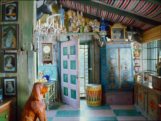
Can we be more selective? Just what kind of criteria must interiors respond to when considered for publications. If a space is published, does it mean it is good and tasteful? I can honestly tell you that I ask myself this question daily. The answer is unequivocally a big fa NO! Atrocious spaces make it into magazines daily and readers are constantly being bombarded with design mediocrity. Just what kind of responsibility are these magazines displaying? Really? The unfortunate result is an overall misrepresentation of good design; a dumbing down of the reader, if you will. Consumers of design publications should be wowed and impressed when going through a magazine; they should be exposed to interiors that apply the right design principles. I want to be clear here, this is not a matter of taste; it is clearly a matter of good or bad design and how much of it we are exposed to on a daily basis. It has gotten so bad that we can't even recognize good design when we do see it. I can't tell you how difficult this makes our job as interior designers. We must continuously explain to clients that their notions of good or aesthetically pleasing design are simply wrong (the great news is that most clients get it,and are glad when exposed to the right kind of material). Not to mention, it would be nice to peruse through a magazine (as a design professional) and learn something new, be exposed to something groundbreaking, or even feel somewhat enriched. This isn't so much about being critical or about complaining, it is about urging publications to seek out professionals with the right background and material that is worthy of publication. I wanted to include some terrible examples that I found quite recently but was persuaded to focus on the positive. Above are some images that were definetly worth publishing!

Tuesday, March 17, 2009

Express yourself!

I have a certain number of Elle Decor Issues I keep handy, from time to time I go back to them for inspiration. Today I fell upon this one and decided to Blog about it. I can say a lot of things about this space, but will only say the few I feel are worth mentioning. This is clearly a space with a very distinct character, a space that changes and evolves with time, a space that makes no compromises. The thing is it doesn't have to, why not surround yourself with Art and objects that move you? Why not tailor your environment to your likes and needs? Ask yourself if you want your home to reflect the individual you are or some image you found in a magazine that seems to be "in" right now. I've said it before and I will say it again, let yourself go, you might like the result!


Thursday, March 12, 2009

Geometric Pattern


Every time I flip through this magazine (House & Garden) British edition of course, it puts a smile on my face. How awesome and powerful are these rooms? They are so strong and the colours so vibrant that you can't help but enjoy them. Geometric pattern, bright colours and some vintage furniture can really create a modern look.

Wednesday, March 11, 2009

Art Gallery of Ontario

Flamboyant architecture genius Frank Gehry, transforms the mid -sized Art Gallery of Ontario ($276 million) into a magnificent space for Canadian and international Art. Gehry, born and taught in Toronto, returns home and makes us all quite proud in a way only he can.


Tuesday, March 10, 2009

Find your own style

Designer and Artist Tony Duquette certainly lived his life on his own terms. The very wonderful legacy he leaves us with is the very relaxed attitude he had towards design, that truly made his approach quite sophisticated. The lesson here is obvious: surround yourself with objects that you love (regardless of their origin or price point). I know what you're thinking, and there is no right approach, just try different things, that very flexibility is what makes life interesting. Have a look at these spaces, they are so refreshing!


The interior of "Hamster House" circa 1980's (after the 1920's mobile home had been pulled out). The secretary desk is 18th century Venetian and the architecturally painted furniture on the left was originally made for Tony Duquette's dressing room at the old studio on Robertson Blvd.


Tony Duquette placed many pavilions throughout "The Empire". This one created out of an existing skeletal metal pipe structure purchased at the nearby Port Hueneme Navy surplus sales and covered with antlers from the Hearst ranch (Tony and Elizabeth were guests of the Hearst family at San Simeon for the last weekend before they gave the castle to the state). The pavilion is topped with a cast resin onion dome which had been thrown out at the back lot of MGM.


Another view of the kitchen at "Frogmore" house where Tony Duquette covered the ceiling with rag rugs from Greece.


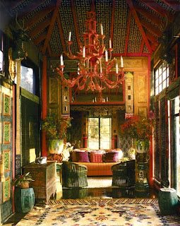
"The Tea House" which Duquette decorated with an antique Chinese silk temple rug on the floor, Asian antiques and a pagoda chandelier of his own invention. The ceiling was upholstered between the red lacquer beams with quilted bedspread fabrics which Duquette felt resembled inlaid tiles.


Tony Duquette decorated the covered porch at "Frogmore" using antique willow chairs upholstered in his own tiger printed corduroy and antique painted Austrian peasant furniture which he purchased in Salzburg in the 1950's when he was designing "Yederman" for the first post-war production of the Salzburg Festival. Note Duquette's cast resin lighted "Ghost Snail" sculpture and the carved Indian horses to which Duquette added the carved wings on their heads.

Monday, March 9, 2009

I was just browsing the March 09 Issue of Elle Decor (love this Magazine!) and I came across these two kitchens. How refreshing to see rooms that feel so personal and lived in, especially kitchens that of late feel so cold and laboratory like. I really enjoy the personal touches like the beautiful white Murano glass chandelier, and in both cases the lovely range of accessories. All these touches give these rooms that "labour of love" feel that truly makes spaces feel cozy and welcoming. Don' t you just want to have a cup of hot chocolate while you are reading your morning paper on a Saturday afternoon.


So personal, warm and cozy


A kitchen should welcome you

Thursday, March 5, 2009

Fornasetti


A brass framed desk in pattern "Giornali" by Piero Fornasetti circa 1955. I can't take how awesome this piece really is!